Current trends and ideas for creative projects
Monday, February 24, 2025 - 13:36
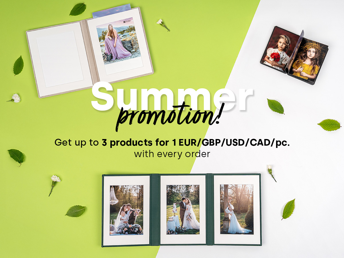
For our U.S. customers: Most of our products are duty-free. If tariffs apply, we will cover the fees so you will not see additional charges at checkout.
Want to make sure your offer for the upcoming season stands out from the crowd? Wondering what to suggest to clients so they choose your services more often and order even more photo products? Or maybe you just need a fresh perspective on your offer but aren’t sure what’s worth adding? Perfect! As Poland’s largest photo printing company, we’ve got some top recommendations for the upcoming year. We even asked our designers and photo product specialists for a dose of inspiration.
If you're anything like most photographers, when a new season rolls in, you sit down at your computer to update your offer - or at least give it a refresh. And then… nothing. You’re not sure what to add, what to drop, or what’s worth recommending. Sure, you’ve got your best-selling products that clients love, but how do you spice things up and make your offer even more appealing?
Think of it like designing a new clothing collection for an exclusive runway show. Fashion trends don’t just influence clothing; they shape interior design, architecture, and even functional art. That’s why top marketing pros keep a close eye on what’s trending - it’s what people want! If you want an offer that attracts attention, it needs to stay fresh and up-to-date with what’s hot in the photography industry. Now, let’s step off the runway and get practical - how can you give your photo product offer a trendy refresh
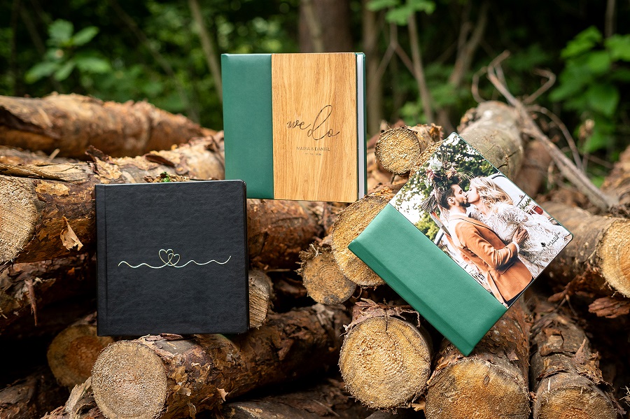
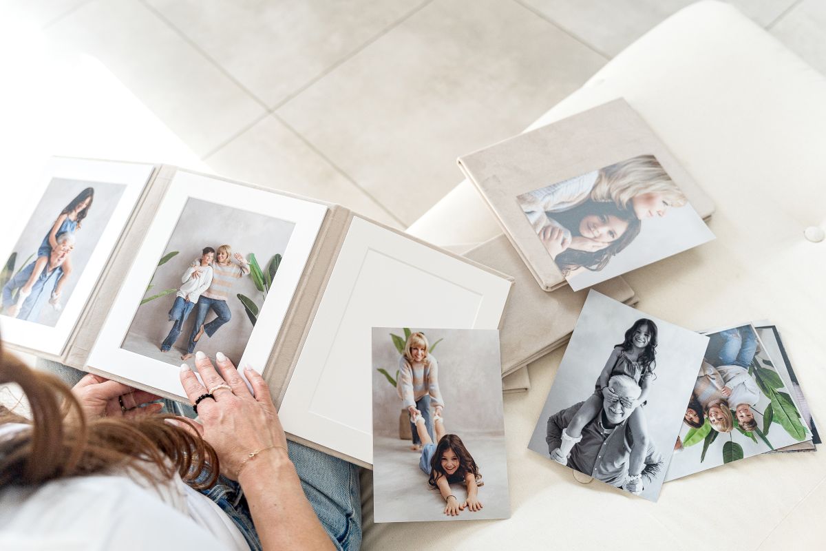
You don’t have to change everything. Start by considering small updates. Maybe you could introduce new materials for covers that you haven’t offered before? What about adding fresh personalization options, like gilding on album covers? Sometimes, just two new sample products are enough to make clients feel like they’re working with a photographer who not only takes great photos but also knows what’s stylish and worth their attention.
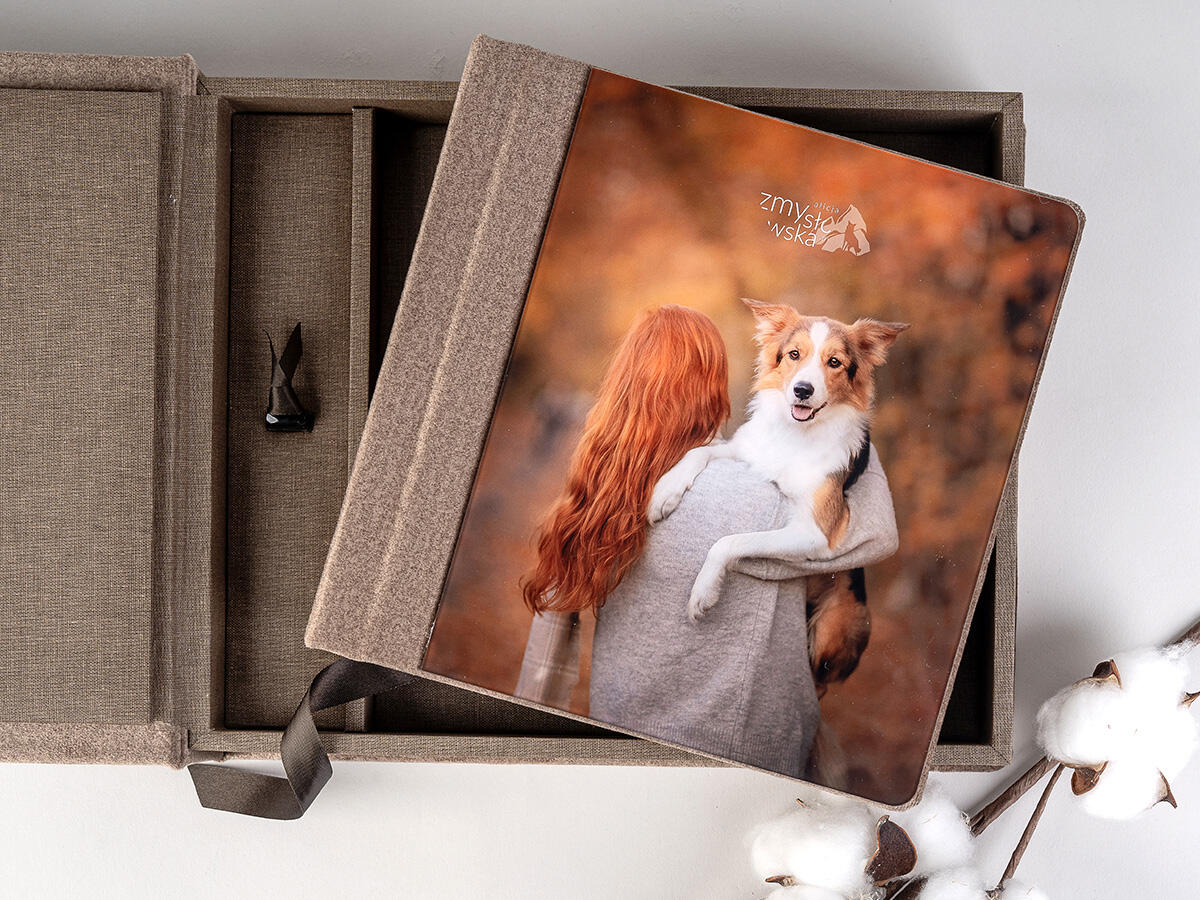
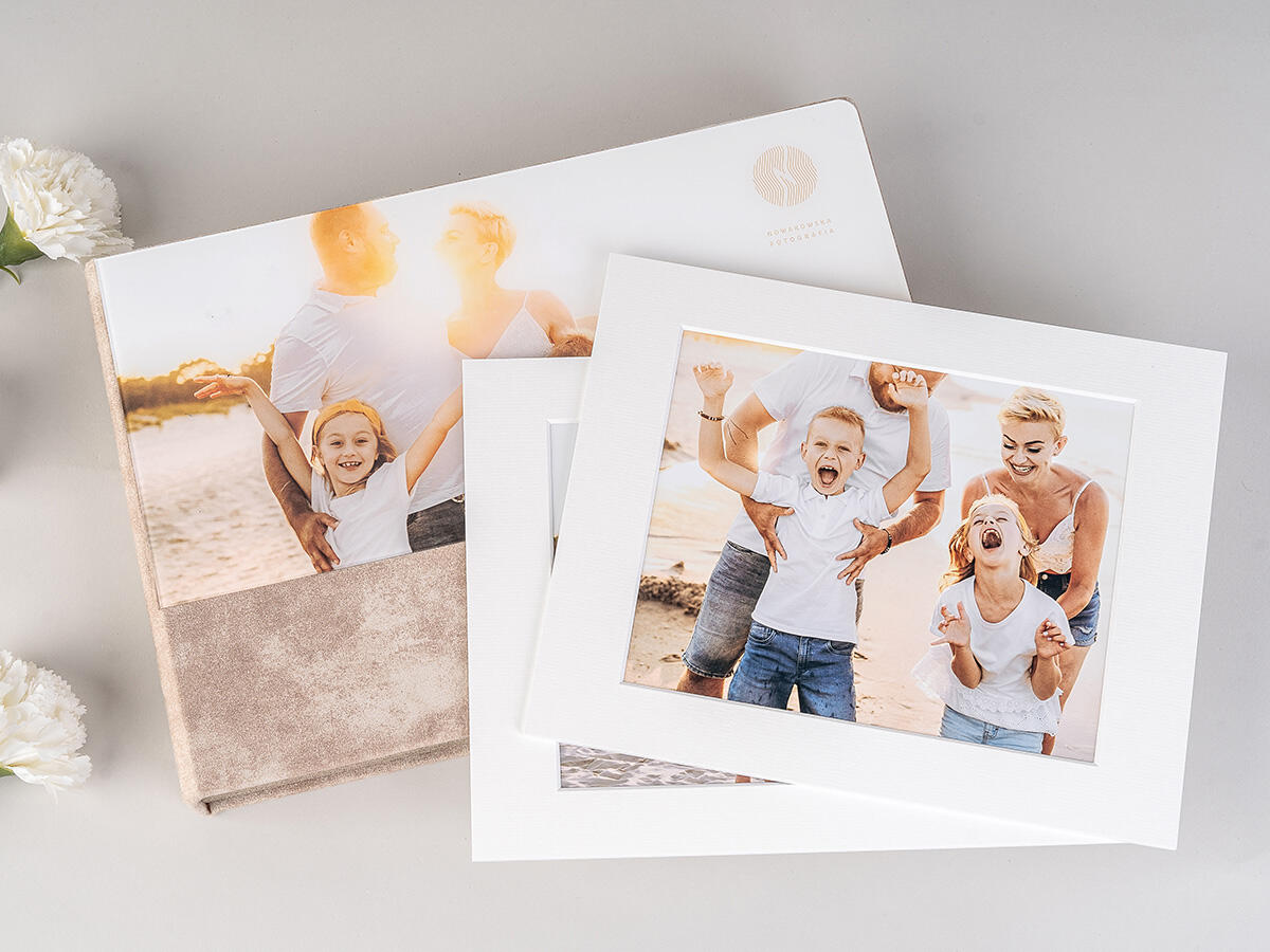
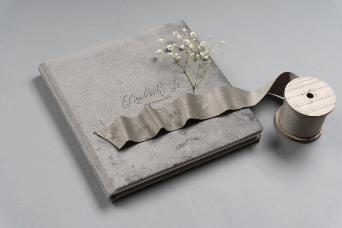
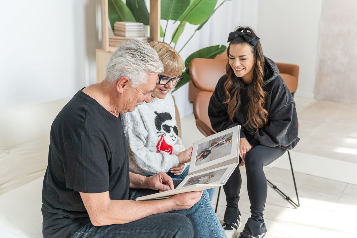
Wedding, communion, and family photography all call for a timeless, elegant touch - no crazy contrasts, neon colours, or bold hues here. Instead, keep your photo products light and stylish, but enhance them with unique personalisation. Gilding, laser etching, or covers with acrylic or wooden finishes can take a classic look and make it truly special.
We asked nPhoto’s lead graphic designer, Grzegorz Wolański, for his top advice for photographers who aren’t quite sure how to mix and match colours, fonts, and patterns. Here’s what he shared:
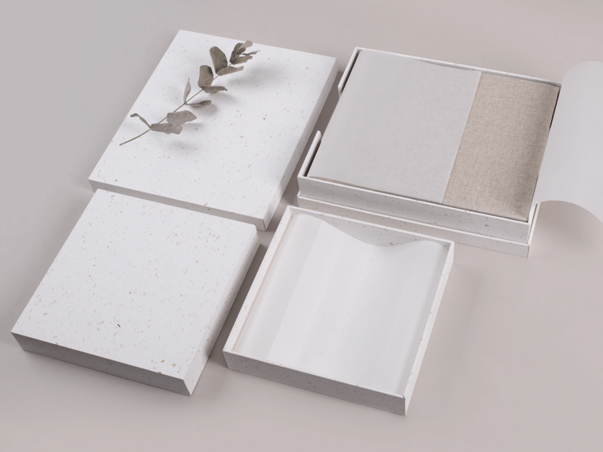
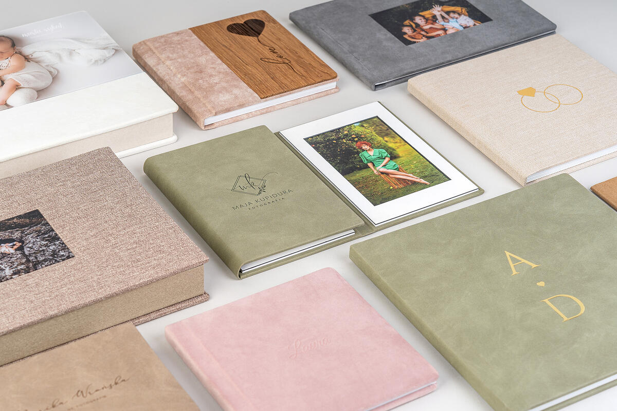
- “First, think about what colours complement the photos from a session. If a photo is part of the product’s cover, the material should match the vibe of the image. When choosing the colour for the box or album, stick to neutrals like white, beige, or light gray if you’re unsure. Also, texture is key! Mismatched textures can ruin the whole effect, so avoid mixing different fabric weaves. Instead, pair velvet with velvet or a smooth fabric. It's good to remember that photos taken in a specific style deserve a matching frame. And here's a pro tip—contrasts can be a bit risky, so it's usually better to go for a cohesive look.
What about fonts? Personalization? What should you choose to make the final result truly stunning?
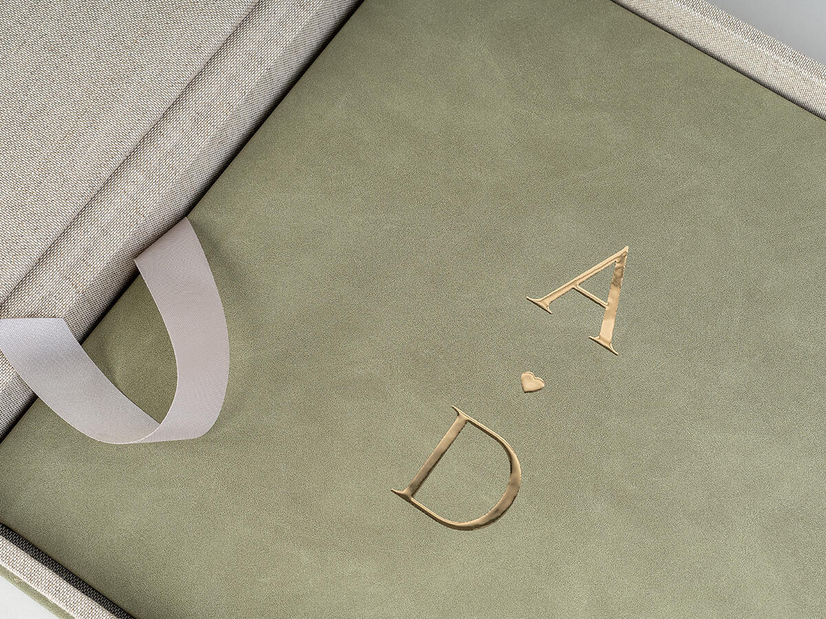
- The fonts should match in style and character. For example, avoid pairing ultra-thin letters with bold, heavy fonts. The font choice should also reflect the theme of the photoshoot. Paper selection is just as important - when chosen correctly, it enhances the beauty of the images and complements the cover colour. Personalization-wise, gold patterns and text remain a top trend, emphasizing the value of the moment and the uniqueness of the product.
What advice do you have for photographers who say that design is not their strong point?
- Our free nDesigner software makes it super easy to ‘try on’ different colours, personalization techniques, and patterns before making a decision. And remember—your clients already love your photography style, which means you have a unique aesthetic that works. Trust your taste! If your offer reflects your artistic vision, it will always make sense.
Running low on ideas? Time to get inspired! Take a peek at the pros, keep an eye on trends not just in your field but beyond it, too. Everyday life is an idea goldmine. Check out what photographers abroad are up to, what colour’s ruling the year, whether decorative fonts are in or simple ones are the way to go. Eco-leather or velvet? Every little detail makes a difference. We asked Monika Lewandowska, the head of our Graphic Design Team, what’s worth keeping in mind to make sure your offering stays on trend in the industry.
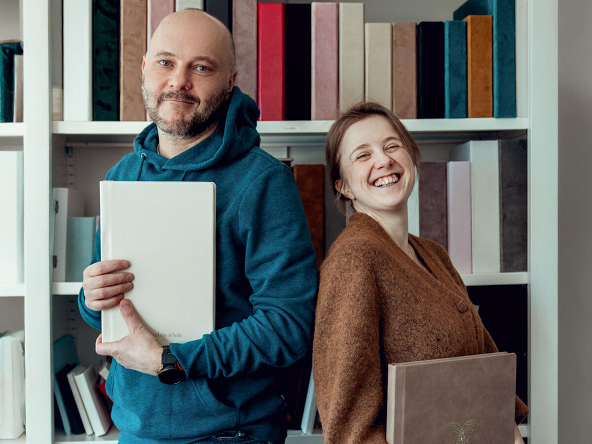
Grzegorz Wolański and Monika Lewandowska
- Earthy tones are still in style! For yet another season, nature-inspired colours are taking the lead, and Pantone’s Colour of the Year 2025 confirms it: Mocha Mousse - a warm, light cocoa brown. It’s a great trend for photography, especially for outdoor shoots, where these natural shades blend beautifully with the surroundings.

fot.: pantone.com
- This season’s trending colours are inspired by… food! We’re talking Cherry Red, Butter Yellow, Aura Indigo, Dill Green, and Alpine Oat. Plus, neon and vibrant shades are making a comeback—something Marta Ponsko beautifully incorporates in her maternity photography.
Colour is just the beginning - textures, fonts & details matter too!
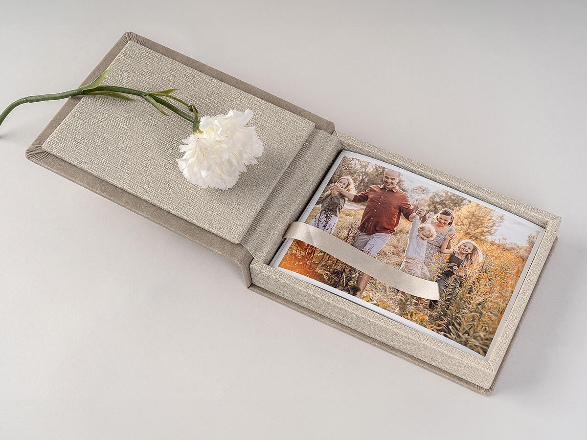
-The cozy trend is still going strong—just like in interior design, soft textures and warm, light tones dominate photo product styles. Velvet covers, delicate fonts, and subtle personalizations are the way to go. What about fonts? Serif fonts paired with calligraphy-style scripts are trending. But don’t overdo it! Sometimes, a simple, well-placed date can be all the personalization a product needs. Monika Lewandowska reminds us: “Like in life, balance is key. A little detail can make a big impact.”
When talking about trends, we can’t overlook shapes, formats, and photo layouts. So, what advice does our expert have?
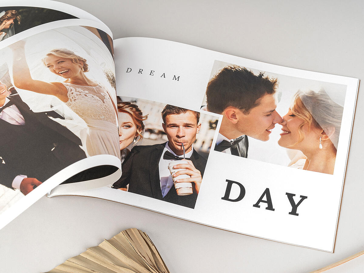
- If you want your photos to make your products stand out, go for an unconventional layout - like a collage-style arrangement or a unique photo format. Arched shapes, in particular, are trending right now and are available in our ready-made Folio Print Lite templates. Another interesting option is the Bento layout, inspired by Japanese lunch boxes,” suggests Monika Lewandowska.
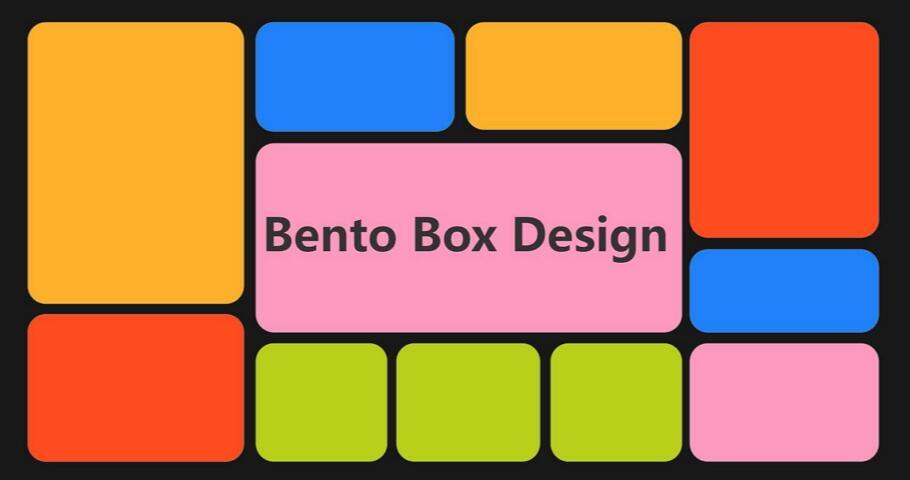
photo: www.mockplus.com
Inspiration from Monika & Grzegorz gathered by Magdalena Łobodzińska
UK/IE/EU +44 (0) 20 3409 4355
US/CA/AU +1 (631) 772 - 0030
customerservice@nphoto.com
nPhoto is a proud manufacturer of the finest quality photo albums and photo products for professional photographers and professional photography studios. With over a decade of experience, we offer artistic, unique, heirloom products to our professional photographer clients using state-of-the-art technology.